
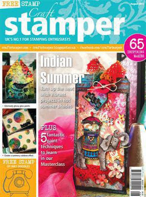
Craft Stamper magazine Review…Aug ’13
This is a slightly different post from me today, but a very exciting one.
I was lucky and privileged enough a couple of weeks ago, to be one of 10 crafters chosen to review the August 2013 issue of Craft Stamper magazine.
I used to have a subscription a couple of years ago, and received this magazine monthly through the door, but unfortunately due to a big move over to Ireland, I haven’t had the opportunity on a regular basis to enjoy it. So that is the reason I jumped at the chance to write this review.
When you first lay eyes on the front cover, you can’t fail to notice the huge amount of vibrant colour used in the design samples, and it is that theme, that is continued throughout the whole issue.
With the glorious weather that the UK has had this summer, the whole mood of this August issue is bright and fun and zingy. So for a crafter like myself who struggles to successfully to be bold and confident with big colours, this is a perfect ‘go to’ reference point, that you can go back to time again.


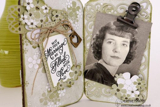
Having had a break from reading the magazine, for a couple of years, I can see a real difference in the layout and overall approach in the presentation of the articles. I find that now, the emphasis is definitely on the articles and allowing us as readers to really enjoy the projects and explanation of techniques a lot more, and without the distraction. What I mean by that is that each project has a full page photograph so you can really study and look in detail at the project, which for me is fascinating and show cases the skill, expertise and professional finish of the designer (something we all as readers aspire too). A small detail, but to me really important, is that all advertising is grouped onto its own pages, the articles are not interrupted by them, allowing full concentration and enjoyment of the work the designers do for us.
The space given to the written detail of the project is much easier on the eye, and no longer follows the traditional magazine format of many narrow columns on a page. Treating each page as an ‘A4’ page, to me is lot friendlier and far less formal, so when you sit and become engrossed in a designers work (usually with a cup of tea) it really feels as if you are in a friendly chat with them and their enthusiasm for craft comes across the page.
Onto the projects themselves in this issue, and as I mentioned, the over riding theme is colour, bold and vibrant, whether it be using distress or alcohol inks, Staz On or Promarkers – the bolder the better.
The ‘Stamping Contrasts’ article really took my eye, as it shows you the diversity of a specifically themed set of stamps – in this case the Indian Elephant set by Chocolate Baroque. I have looked at sets like these and wonder just how diverse they would be and how many different styles of card I would make with them. Often not seeing passed the actual suggested theme.
The style of cards the designers have created are amazing. All inspired by the Asian technique of Batik fabric dyeing, but the contrast in style where Christina Dark has beautifully and intricately coloured all the details, to the more subtle tonal stamping of Jean Franks Beck.
What I also really revel in with Craft Stamper is the brilliance of the designers to create their own design papers, using stamps and inks. I teaches us as readers how to marry up stamp designs to create an overall bigger picture. As a stamper, first and foremost in my crafting, I always find it fascinating and will spend hours looking at work by the likes of Liesbeth Fidder, who has created a wonderful ‘Steampunk Romance’ card and written an article, breaking down the process, giving me the encouragement that I can also have a go.
I was inspired to create an accompanying card for this post, after reading about Trish Latimer’s 3D Embellishments, Wire Workshop. Now craft wire has been in my stash for years, so to be able to have a fab and fresh use for it was fantastic.
Trish teaches in her tutorial how to create (fully enclosed) shapes with the wire, adhering them onto a tissue paper, that you have stamped or coloured, and then filling in that enclosed shape with ‘glossy accents’ to create a glossy embellishment.
You can see below that I, have printed an ‘egg’ design from the Curio digi Kit designed by Sarah Hurley. I have then shaped the craft wire around the egg, and filled with glossy accents. The excess tissue is cut away when fully dried, resulting in the three translucent egg shapes.

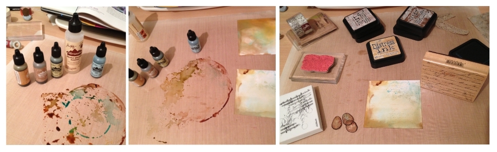
To create the card on which they will embellish, I decided to use my alcohol inks and a selection of my stamps and distress ink, to create the background. Reverting back to form I opted for more neutral colours.

The photograph below shows the outcome, which I was not particularly happy with. I don’t know about you, but most times, the original idea that I started out creating, morphs somewhere along the line into another idea, and the finished result is nothing how you imagined. Well this is one of those times. Having stamped the bird, I wasn’t happy with the composition, but very much liked the colours of the bird, so I changed tack.

The following set of photos here, show that I re-stamped the bird onto white glossy card with distress pens, and used another technique from the magazine to create another background. Now this was a first for me, and I have to thank Elizabeth Borer for this in her article (page 69) – Painted backgrounds. I used crumpled cling film to transfer the alcohol ink into my project, it created the most wonderful soft distress look, a perfect backdrop for the bird.

The results and final project are here below, inspired by a number of projects from Craft Stamper 2013. I still have to work on the boldness of my colours, but watch this space, I will definitely be giving it a go.


I’d like to thank you so much for taking an interest in this post, and persevering with me.
Very many thanks also to Paula from Craft Stamper for giving me this opportunity, I have thoroughly enjoyed this as a little project.
xxx


22 Comments
Sylv
Wonderful review, I am with you that the mag has improved over the years, the articles are always inspiring it's finding the time to try them all out. Your projects are fabulous I do love the colours and the hand made embellishments.
Sylv xx
Linda Simpson
Well what a fabulous review and love your creations. I love the craft Stamper and have to agree that the front cover just welcomes you and inspiring features.
Congratulations on being asked to review the magazine.
Hugs
Linda xxxx
KarinsArtScrap
congratulations Claire you have made beautiful cards.
greetings karin
lindyloo
great review and what what wonderful cards x
Nicky Wilcox
Fab review love the cards xxx
Joan Macdonald
Claire this is a fabulous posting, well done on being asked to review the magazine and I just love everything you have made. The card is beautiful. We are just having a quiet few moments before we all go to the Marina and probably an ice cream and coffee.
Looking forward to seeing you Anthony and the boys tomorrow.
Mum xxxx
Chris
Congrats on your review, and your cards are fabulous. Chris xx
Naomi
Congratulations and what a lovely project you made.
Carol C
Gorgeous card, I love the colours and what you did with the eggs xx
Cumbrianlass
A great review and the card is fabulous.
Janet xxx
jane stillman
Brilliant cards, and a brilliant review
Avril Ann
Fabulous review Claire, I enjoyed reading it, like you I had a subscription and loved still love this magazine, but I had to cancel all my subscriptions due to, too little pennies, and I have to say I miss it for inspiration, I love your projects, I sometimes think that it is good that we crafters don't all do the same thing, I love Steam Punk and Gothic, and can never achieve the result that I see out there on blogland, but in saying that many who have done these, like my Cute and want me to help them achieve that look…we are what we are, if you know what I mean…xxxx
Tricia
Wow they are great.
Kate M
Great article – enjoyed reading it. Great cards
xx
Krafty Girl
Fabulous review hun, absolutely love the cards they are stunning xx
Katy - Editor
Thank you so much for taking the time to write such a detailed review. We are so pleased you like the mag! Katy x
isisimaginings.com
Your cards are gorgeous & I agree with every word of your CS review.
Handmade by Bron
Clare, Thankyou for the great tip about using cling wrap, can't wait to try it.
Pauline Wheeler
Hi Claire, I have been thrilled at the opportunity of contributing to the Craft Stamper magazine, it has to be the best on the market. Well done with your review I look forward to reading more from you
P x
Deirdremf
I agree with you completely about Craft Stamper mag. I love it dearly and devour it each month. Then i send it to my sister in California.
Trish Latimer
Wow, I LOVE how the eggs turned out Claire! I'm so glad you were inspired enough to actually have a go, totally gorgeous result!! Trish xxxxxx
Deborah Frings
A really good review. I have CS delivered to me in the States and I love to sit down with a coffee and have a read when it arrives.
I think your little egg embellishments are really lovely and both cards are fab!